Understanding the Psychology of Shop Layouts

Healthcare Interior Design: How It Can Improve the Patient’s Experience
11th May 2022
Restaurant Design Trends 2022
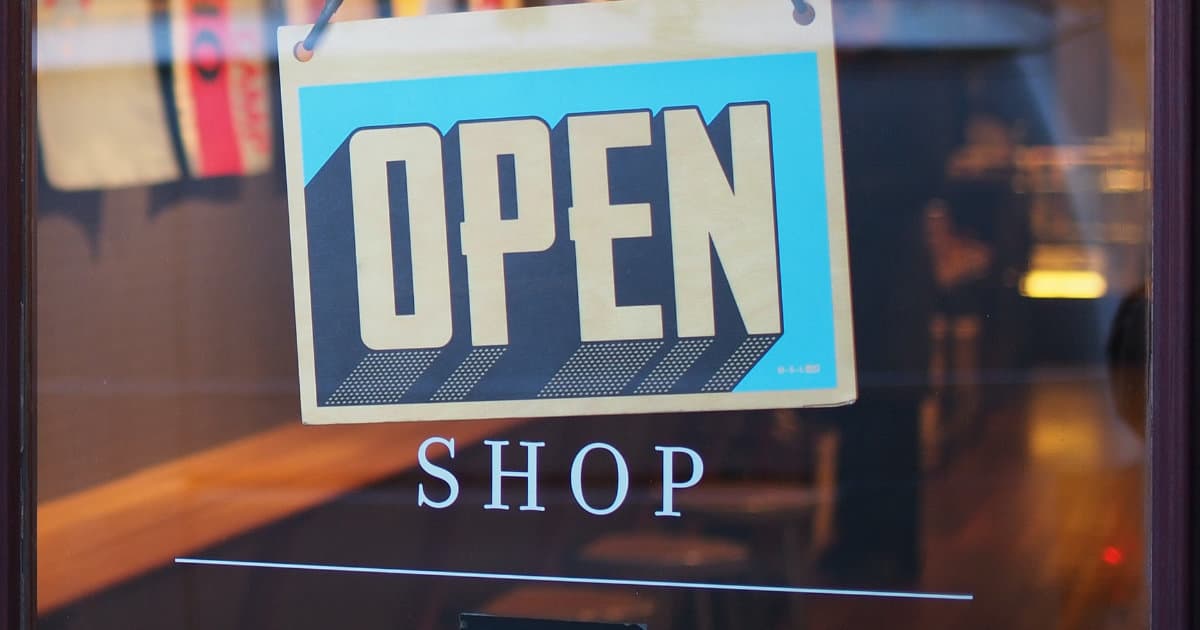
15th June 2022Your shop window is like the homepage on your business website – it tells the customer what you sell, it portrays and communicates your brand, and it creates the atmosphere which they will become a part of if they step inside the shop.
In short, your shop window is essential to drawing in business. But once customers and potential customers step inside, what can you do to improve and enhance the customer experience and encourage them to browse further and eventually buy?
It all comes down to psychology and the way you use layout, spacing, design, and details to create a customer journey throughout your store.
The part that psychology plays when entering a shop
To make sure that your shop layout is optimised for the customer, you need to understand who they are and what they value. If you want your customers to browse and discover new things when they enter your store, then regular updates and a focus on new stock is key. If your store is built for convenience, shoppers want to know exactly where things are and how to find the items they are looking for.
More than that, creating the right environment means not just filling the shelves with what your customer wants – it also means focussing on lighting, colour schemes, and the details that make your store feel welcoming. When a customer feels valued and special, they are more likely to spend – so take the time to build an enticing entranceway which encourages them to stay and browse.
Things to consider as you design the ideal shop layout
With layout playing such a big part in the psychology and decision making of your customers, recognising the key areas to focus on and consider is integral to ensuring sustainable business success.
As you read through the following things to consider and points of focus, ask yourself which boxes your shop layout currently ticks – and what changes you could make to create an even better customer experience. Perhaps it’s time for a shop fit-out?
1. Big, welcoming entrance
As your customer walks through the door of your shop, you want them to feel inspired but not overwhelmed. The majority of customers automatically turn to the right when they enter a shop, so consider this behaviour when placing both your items and signage options.
2. Aisle space
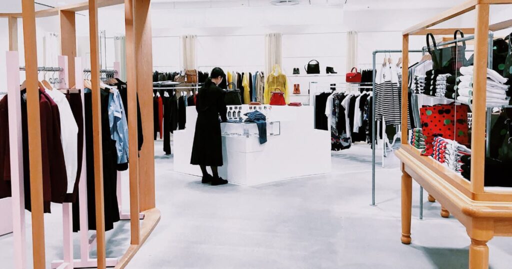
If you store has the benefit of lots of aisles of produce and stock, making sure that the aisles are wide enough to comfortably accommodate shoppers is crucial. When shoppers start to feel crowded, they will give up and leave – after all, nobody wants to browse while pressed against someone else.
3. Priority shelving
There is a reason why the most popular brands are often placed on the middle shelves of a vertically-built store section – and it’s all about psychology and layout. Our eyes are drawn to those products that are right in front of us – meaning that whatever is placed on those shelves is sure to be seen first. That’s why brands pay top dollar for middle shelf placement, and why the cheapest brands are always up high or down low.
4. The customer journey
The “customer journey” has become somewhat of a digital marketing and e-commerce buzzword in recent years, but it still plays a vital part in the psychology of customers in physical stores. When your customer has a clear and effectively signposted journey or path to follow through your store, you make it easier for them to pick something up and buy it. If they have to look for the tills, you will start to lose them. It’s as simple as that.
5. Use aisle-end display units and standalone displays
Whether you use them to launch a new product line or spotlight a bestseller, using these display opportunities is a sure fire way to catch customer attention – provided you do it right. This is where it’s important to involve a marketing team, as they will know the best way to speak to your customer and really get them to buy into a brand or product.
As the master of layout however, make sure you regularly walk around your store and pay attention to how stand out these displays really are.
Now think about your store or shop layout. Does it play into and utilise the knowledge from all of these psychological considerations? If not, it might be time for a revamp, renovation, or a simple redesign of your shop floor.

